
Using articles from CNR publications circa 1960,
this post considers the care taken by Canadian National Railways
in selecting their new public image.
The symbolic maple leaf which served all Canada had become part of CNR history. The final retirement of steam locomotives and all the related changes in modern railway work which this entailed became an opportunity to reintroduce North America's longest railway system to the public.
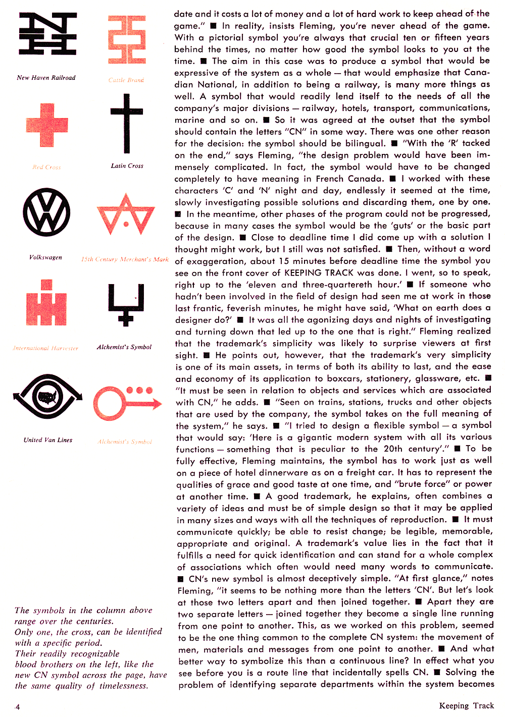
An artist who made a remarkable contribution to the field of Canadian graphic design was behind CN's symbol - which has now been in use considerably longer than he originally envisaged. There was also a concentrated effort to test new paint schemes in prototype. With a large fleet of rolling stock to put through a costly 'rebranding', and with hell to pay in public - in Parliament - if a poor, expensive design was chosen for the CNR crown corporation ... you'll understand why several less attractive or less practical experimental schemes were discarded in the process.
Perhaps to identify an example of what not to do, an enthusiast (one who is not related to me) commented that CPR's 1997 golden beaver design may have looked good printed on paper in the boardroom, but that it had not transferred well to full-sized locomotives. But who cares? ... Today's dominant perspective is that an attractive paint scheme improves neither tractive effort nor net quarterly earnings. Of course this was equally true in the 1960s ... but the minds of CNR's leaders were not consumed by Wall Street's meaningless accounting confections back then.
To Canadians, the most craved and appreciated compliments have often come after our accomplishments are 'noticed' (usually after much bloodshed and loss of life) by 'The Mother Country' or, more recently, by our collocated 'Senior Instructor'. Accordingly, near the end of this post, a noted US railroad journalist praises CNR's work as a model to be followed.
Finally, Phineas Taylor Barnum's quote
'I don't care what they say about me, just make sure they spell my name right!'
renders a minor indignity when it is ignored by our local paper in the last article.
* * *
In the December 1960/January 1961 edition of CNR's magazine was this article.


* * *
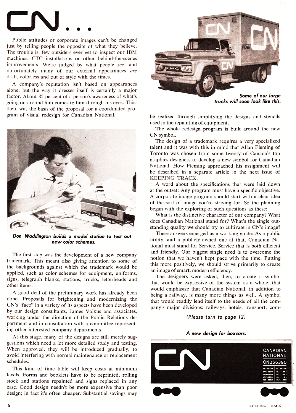
A month later, in CN's Keeping Track, the topic was continued.


* * *
Two months later,
financial results (not including the usual government top-up) are presented,
along with more on the practical considerations and symbology of the new paint scheme.


Corrected for inflation, employee 'average annual earnings' of $4600 in 1960 (below) would equal about $39,000 in 2017.

Perhaps a coat of fresh paint on a train brings out the 'little kid' in all of us? ...


* * *
June 1961 - some American praise.
Note: Corrected for inflation, a billion dollar overhaul would be $8.3 billion in 2017.


* * *
The 'Oval' - corporate magazine of Canadian Industries Limited (CIL)
provided an account of Canadian industrial and transportation progress,
but did not delve into CN's colour scheme in particular.
My father carefully 'stitched' these two images together with Scotch Tape.
The pigments on the image to the left have aged differently.
 |
| from: CIL Oval; April 1962. |
* * *
1978:
 |
| from: Kingston Whig Standard. |